The CSS table display Web design pattern emerged among Web designers. CSS table display is very well supported across browsers. It gave the ability to use HTML table semantics but keeping the table layout properties.
The Issue!
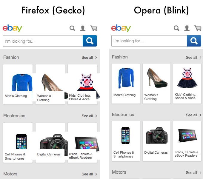
But it also creates Web compatibility issues when combined with max-width: 100%;. This is a rendering of the current mobile Ebay site in Blink and Gecko. There is an open Web Compatibility bug about it.
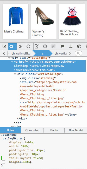
The markup for each individual items in the page is following this structure:
<a href="http://…">
  <div class="verticalAlign">
    <img class="stackImg" src="….jpg" data-src="….jpg">
  </div>
</a>
associated with the following CSS:
.mainCatCntr .stackone .catImgBkg a {
    display: table;
    width: 100%;
    height: 100%;
    padding-bottom: 45px;
    padding-top: 10px;
}

.mainCatCntr .stackone .catImgBkg a .verticalAlign {
    display: table-cell;
    vertical-align: middle;
}

.mainCatCntr .stackone .stackImg {
    display: block;
    position: absolute;
    top: 0px;
    z-index: 1;
    max-height: 94px;
    max-width: 100%;
    border-radius: 2px 2px 0px 0px;
}
As we can see a first nesting element with display: table; and then nested an element being display: table-cell;. Finally inside this element one which is specified with max-width:100%;.
How To Fix It?
The first approximation to fix it is to replace max-width:100%; with width:100%; but then when the space is bigger than the image size, the image stretches. It is not a very compelling fix, maybe it's alright for sweaters and mirrors, but less so for cameras.
The fix is this one:
.mainCatCntr .stackone .catImgBkg a {
    display: table;
    table-layout: fixed;
    width: 100%;
    /* height: 100%; */
    padding-bottom: 45px;
    padding-top: 10px;
}
We added table-layout: fixed; just after display: table;. It fixed the images going out of their boxes. We still had an issue with the vertical alignment which was fixed by removing the height: 100%; but that was not the core issue. Once these changes in place we get the same rendering than blink rendering engine.
And most important, the same fix doesn't break the layout in Blink. The work now is to convince ebay to modify their CSS so we can have a version which is working on Web Compatibility. Note that this type of issues could have been detected through automatic testing and screenshots.
Differences In Rendering
But wait… it's not over yet. Which rendering engine is implementing the correct behavior? Note that the answer is always difficult, it can be one of the following:
- The specification describes the correct behavior and one or more browsers is not implementing correctly the specification.
- The dominant market share browsers defines what is the correct behavior and we should modify our implementation to match what the dominant browser is doing. (Yeah. It's the it-sucks part of the story.)
The thing is that the users do not care which one of these two or other differences. What the user sees is that it is broken in one browser and not in the other one. The same way the designers use a dominant market share browsers with bugs considered as the normal behavior because they just don't know what should be the correct behavior. This is what Web Compatibility is about.
I found a couple of bugs at Mozilla talking about the same issue.
- Bug 975632 - max-width: 100%; doesn't work inside tables or display: table
- Bug 434230 - max-width: 100% works differently from width: 100% for images in tables
I let you read the comments of the two bugs and tries to decipher the interpretation of the specification text. If you have no issue and understand everything, you get your degree in Web Compatibility Shamanism. Maybe we should start deliver these. Web Compatibility Shaman should be as ridiculous as JavaScript Ninja or Python Rockstar?
Otsukare.